
In conjunction with commissioning Lee Wybranski to create the Tour Sauce poster series, we’d like to share what drew us to Lee in the first place. Randy and I have been longtime admirers of his work and the timelessness with which he commemorates golf tournaments – often his works weave seamlessly with the feelings and moments seared into memory from a particular week. Digging deeper, even if you’ve never seen one of his posters I guarantee that you are still familiar with his work through the many logos he’s worked on, sometimes from scratch, sometimes just polishing up an old classic. Additionally, D.J. worked with him in his previous role at Skratch a couple of years ago out in Scottsdale and still talks about Lee’s ethos and demeanor with admiration. We feel honored to be able to work with someone so fluent in the history and nuance of the sport. I sat down with him recently to learn more about his career and craft.
Tron Carter: How did you get into golf?
Lee Wybranski: My first commission in golf came from Winged Foot; it was a drawing of their clubhouse, and I did that in ’95. I’ve been working in golf since then basically. Once you get a job or a client like Winged Foot doors tend to open. First few years of work from ’95 to ’01 I was doing artwork for private clubs. And then a client switched jobs and became the Director of Golf at Atlantic City Country Club right after the casinos bought it, and he asked us if we could help rebrand the facility so that was our first effort in the design arena. We designed a new logo and all new printed collateral for ACCC, which at the time was over 100 years old, so that was a neat job. And that got our foot in the door and was a nice resume piece for a lot of the design work we do.
The Midnight Troubadour
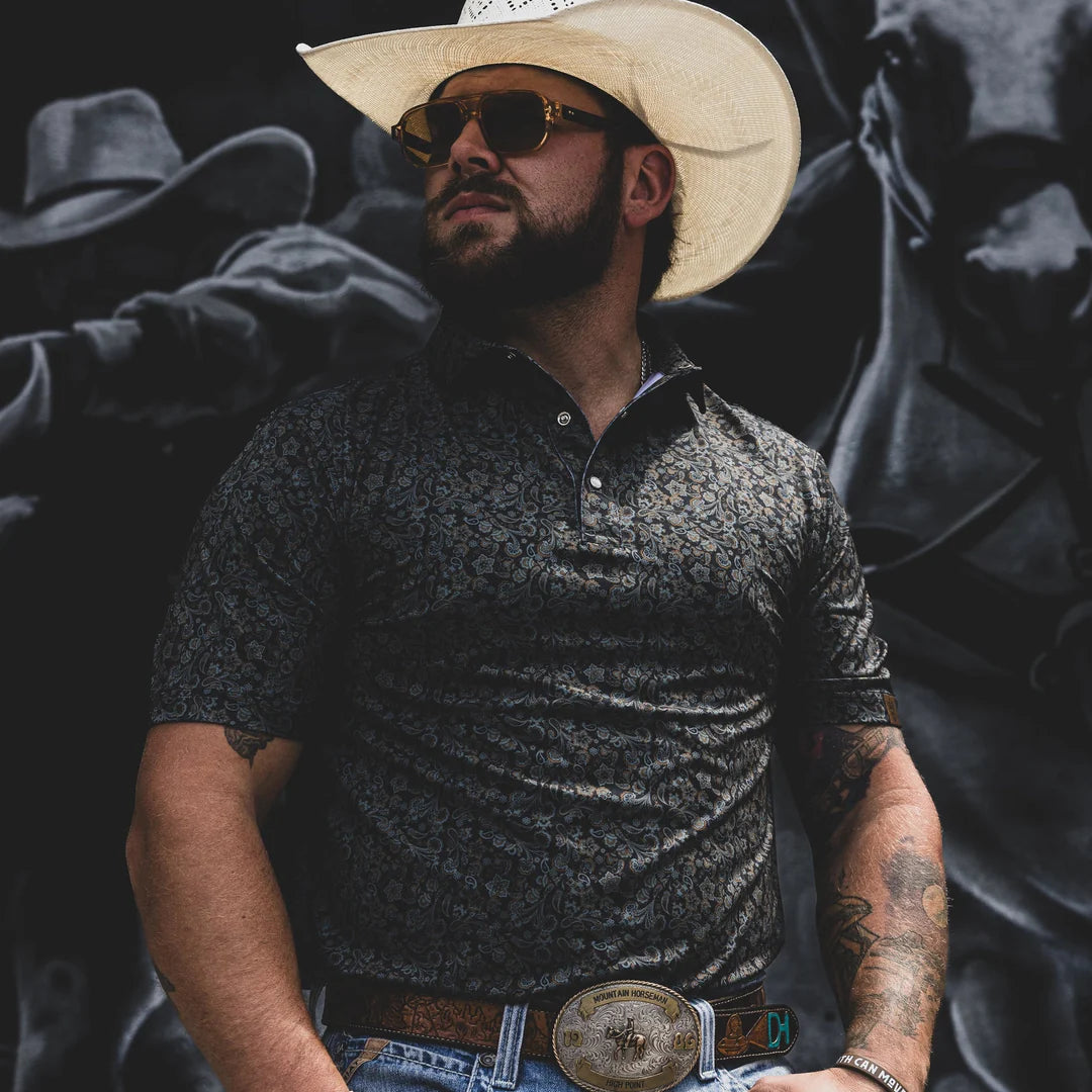
Tough and timeless, this polo is built for the long ride. Featuring a crisp, non-collapsing collar and a rugged, stretchy fabric, it's the perfect shirt for any cowboy's wardrobe.
I started working with the USGA in ’02 designing the logos for the US Open. I worked exclusively with the USGA as a logo designer for five or six years, starting in the fall of ’02 with our first logo being ’04 at Shinnecock. We’ve done every logo for them since then except for ’05 at Pinehurst and ’10 at Pebble, both of which have their own robust marketing teams. Although, we did the logos for the joint men’s and women’s U.S. Opens at Pinehurst in ’14. Now we help them with all 14 championships. But they’ve started to streamline their branding a little bit. In keeping with what the R&A does, they’ve created a bit of a template so there’s not as much originality and differentiation from year to year. The icon will change but the text setting will remain consistent. It makes it a little less fun for us, because we kinda reinvented the wheel every year for the US Open. Not quite as fun from a design perspective but there is sound rationale behind the decision.
TC: Will it be the same font on the posters as well?
LW: No, we have more liberty with the posters. We don’t have to maintain the logo typefaces on the posters. I get to look for interesting fonts for that. That’s the cherry on top for me, the really fun part, brings it all together.
TC: When did you add the R&A and the PGA of America to the mix?
LW: We started with the R&A in ’12 at Royal Lytham, which was kind of interesting. One of the coolest parts of the projects is going to the events and being there for some greatness. I was reminiscing in my head on all the different majors I’ve been to in the last fifteen years and which ones I would put on my top shelf. And my first British Open wasn’t one of the best, it was when Adam Scott spit the bit and bogeyed his way in and Ernie won and it was like shell shock, nobody could believe it. Everyone loves Ernie but everyone was just walking around feeling terrible for Adam Scott. And then my first PGA was the next year, ’13 at Oak Hill. When Duf broke the records there, that was pretty cool. I met Dufner the year before at Lytham. He came into the merch tent and the next year he won at Rochester and he ended up buying the original painting. I love Duf. He singlehandedly raised my game for a season and a half because I loved his old-school waggle so much and I just started to copy it and was hitting it really good.
TC: What are some of your favorite posters that you’ve done, or logos for that matter?
LW: The first U.S. Open poster was Torrey when Tiger won on the broken leg in the playoff. I went in there not knowing anything of what to expect and I created one of my favorite images. It was my first chance on the big stage and it was very well received. They sold twice as many posters as they’d ever done before, so it was very exciting business-wise as I’d never seen that level of demand for my work before. I’d go to lunch and come back to twenty-five people waiting for me to sign posters. And then Tiger – it makes a big difference when there is a special vibe out on the golf course. It doesn’t make or break your business if Webb Simpson wins, but the more memorable the event the better for us. And then we’d done the logo there, and since Torrey didn’t have a very established brand mark we had a lot of creativity there, so even the logo was getting written up in the local newspaper. People loved the logo and then Tiger won in that fashion. I kind of thought they were all going to be like that. And then the next year was Bethpage and it was like ten straight days of mud, a hundred thousand angry New Yorkers and an under-the-radar guy winning.
TC: I actually loved that poster, one of my favorites you’ve done. It’s a little moody and dark – kind of fits the event.
LW: Don’t get me wrong it was a cool poster, but the event and the business end of it was a slog compared to San Diego the year before. It’s got a shadowy feel.
TC: 2014 Hoylake was like that too with the clouds and the font, another one of my favorites.
LW: Thanks man, Hoylake was interesting because whenever I go and do these projects I try to go find the two or three main characters in the poster – what’s going to be the star? What are going to be the two or three supporting actors?
So Torrey we knew the tree was going to be the thing and then the ocean obviously would be in there. At Merion we knew right away we were gonna focus on the basket because everyone loves that wicker so much. But at Hoylake it was interesting because it’s a real flattish golf course, even by links standards, its visually unremarkable. But the wind blows so strong there that when I asked the members and tournament chairman about the signature elements they basically talked about the weather being a huge character when you play golf there. So the only way I could showcase that visually was to make the poster more about the sky than the golf course.
TC: Do you ever take those themes back to the committee or club and tell them what you came up with and they push back and say that’s not how we want to represent the tournament?
LW: Well, I usually work with the governing body more than the club, so I’ll solicit input from the club as sort of grist for the mill, but then I’ll typically generate three concepts and then submit that to the client and we’ll tweak it and refine it and do a few more rounds of proofs before I paint the art. The USGA is definitely the most involved and collaborative client. They have a well-earned reputation of wanting their fingers all over everything, they do that with the poster just the same. But your most demanding clients often get the best out of you. I don’t have a problem with it. I’m definitely direct about my recommendations, but I’m open to suggestions. I learned early on that it's a lot easier to make something and show them why it’s a bad idea versus just trying to convince them it's a bad idea.
TC: How far in advance do you typically do the posters?
LW: Typically 1-2 years out at most. The U.S. Open never wants to unveil next year’s poster until this year’s event has concluded. That said, we try to do them a little earlier every year. Oakmont or Merion, a place with a loyal membership, then I’ll make every effort to get it done for the holidays the year prior. Versus somewhere like Erin Hills that got done 4 or 5 months prior.
TC: I did see Torrey Pines, I think 2021 on your site…
LW: Ahhh yeah, that one’s cool. Torrey’s one of our best clients. It was very much inspired by Endless Summer. That’s
Source: https://nolayingup.com/blog/interview-artist-lee-wybranski